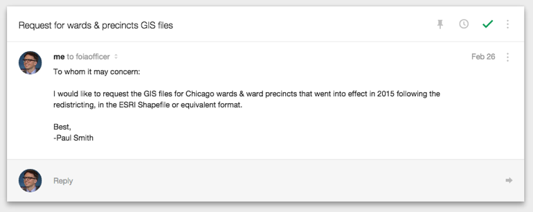
Chicago wards & precincts shapefiles in 2015
Update: On April 6, 2015, the City of Chicago updated its Data Portal with the official wards and precincts shapefiles.
tl;dr: I tried to make a map of Chicago election results, I found only out-of-date wards & precincts shapefiles, I had to FOIA the up-to-date versions, I got them, I republished them so anyone can download them, and finally made that map.
Read on for the full saga.
After this week’s municipal general elections in Chicago, I was looking for detailed results in the mayor’s race, which didn’t end Tuesday night but is headed for a run-off between Mayor Rahm Emanuel and challenger Cook County Commissioner Chuy Garcia on April 7. Specifically, I wanted to see where in the city the support for each candidate was, and at as granular a level as possible.
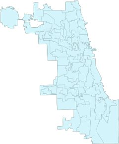
The Chicago Board of Elections posts vote tallies by precinct (50 wards in Chicago, with on average 40 precincts per ward). Precincts are the smallest unit of political geography—in Chicago, they are roughly a few square city blocks each. Given the neighborhoody nature of Chicago and the block-by-block affinities that exist (which leads politicians to produce carefully sculpted gerrymanders like the 2nd Ward in order to corral voters into favorable pens), a map showing the relative intensity of voting percentages per candidate by precinct would be a good tool for aiding detailed understanding of this election or any election, and a building block for many possible similar analyses in the future.
So I set out to make such a map. My plan was to gather the vote totals per precinct, shapefiles of the city ward and precinct boundaries, and join them together using tools like d3 to draw a choropleth or thematic map in a web browser. This is a straightforward plan and is well-trod ground. However, I naïvely assumed the official source material I gathered would be accurate and up-to-date.
After scraping the vote totals from the BOE site[1], I downloaded the wards and precincts shapefiles from the City of Chicago’s Data Portal site, which is a service that hosts many different types of data, from building permits to restaurant inspections. I did this by typing “wards” and “precincts” into the search box and downloading from the results pages the links titled “[Boundaries
- Wards]dataportalwards” and “Ward Precincts”. There was nothing to indicate that these files were out of date, nor anything else to indicate that they were not the current, authoritative source of these data sets.
I put together a first draft of the map and shared it with some colleagues who are experts in mapping and Chicago data. They quickly pointed out that the map appeared to be using the old wards and precincts.[2] In 2012, the city council approved a new set of ward boundaries, redrawing the city’s political map. They were to go into effect in 2015, and this week’s election, which included all 50 aldermanic races, were to be contested on this new geography. The conspicuously missing new 2nd Ward was the tip-off my map was wrong.
I searched for the updated boundaries, but came up with only unofficial sources, and only for wards at that. There was the WBEZ map from their original 2012 story, and the Tribune had created a side-by-side comparison of the old and new wards. But I couldn’t trust these for my own use, because of their uncertain provenance. And without matching updated precincts, I couldn’t join vote totals for use in a map in any case.
Taking a page from the people person at my old job, I made a phone call to the Board of Elections: maybe I could just ask for the data and they would give it to me? I stated my request very plainly and without explanation of motive, and was told to “hold please” a couple of times while I bounced between departments. A few moments later, I heard “Districts and Boundaries” on the line. Success! Here was, literally, the person who could help me, right then. Or so I thought. I repeated my request, and without a moment’s hesitation, the Districts and Boundaries voice said that I would need to contact the BOE’s FOIA officer, and here was their email address.[3]
It was hard to tell how much of this was bluffing, as in, let’s see you actually bother to make a FOIA request, but I went ahead and stubbornly wrote an email to the FOIA officer anyway. I was under no illusions that my request would be fulfilled quickly enough to make my post-election map still relevant.
I then took to Twitter to register my displeasure for this state of affairs—we just had a citywide election for our top local offices, operating on the assumption of the new city council-vouched districts, and yet, despite nearly a decade of the open data movement, despite official portaldom, the key base layers of the political strata were still available only to the learned monks—and moved on.
Lo, but was my request not answered but a few scant hours later! I can’t tell you how surprised I was to see this in my inbox:
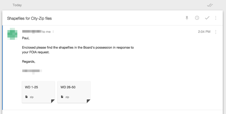
I thanked the officer and downloaded the payload, which was a set of 50 folders, each corresponding to a ward and containing a shapefile of that ward’s precincts therein. I eyeballed the boundaries with QGIS and was satisfied that they appeared to be legit. (Again, the shape of the notorious 2nd Ward was the main clue.)
In the absence of official publication, I was determined to at least not have the next person who goes looking for wards and precincts to wind up in FOIA land. As relatively pain-free as this episode was, the fact that I had to engage with the FOIA plumbing in order to fulfill a minor data request is not good. And there is every reason to think that a typical FOIA request will take orders of magnitude longer to fulfill than my jackpot.
My approach was to self-publish the data, but to be clear about its source and my methodology for any transformations. While I’d much rather prefer this data appear on Data Portal, I’d also prefer not for our collective energies to be wasted in pursuits such as these.
Regarding those transformations, I had a set of precincts, but I also wanted the wards that derive from them (a ward is completely defined by its constituent precincts). I imported the precincts into a PostgreSQL database with the PostGIS extension. From there I created wards by grouping precincts by their ward number, and unioning their geometries (i.e., merging a bunch of small precinct polygons into one large ward polygon). Then I exported from the database into various geospatial data formats—Shapefile, TopoJSON, GeoJSON, KML, etc.
I made these exports available for download by anyone, hosted on GitHub.
I finally was able to make the map I wanted, at least, the first-order map, a basic voter preference density map. I hope to build on this data infrastructure with different overlays, result sets, future elections, and so on.
You can view the map here; choose between mayoral candidates in the drop-down selector to update the map with their vote percentages.
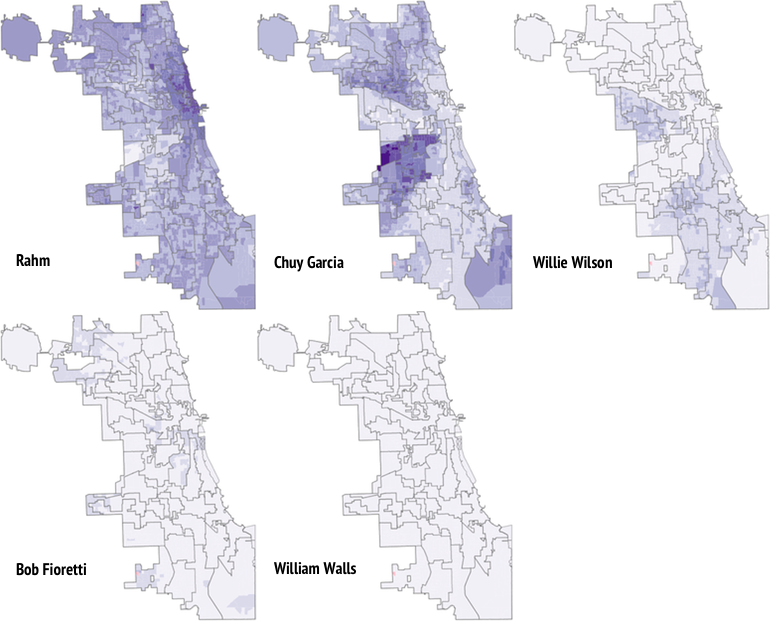
With several candidates, in can be useful to see them arrayed as small multiples for easier comparison[4]:
I’d like to see the left hand of the operators of the Chicago Data Portal talk with the right hand of the Chicago Board of Elections, and simply take down the pre-2015 ward and precinct boundaries (or better yet, rename them to something that won’t be mistaken for the most recent version and leave them up for historical research) and get the current shapefiles uploaded as soon as possible. In the meantime, I hope that interested parties will avail themselves of my hosted shapefiles.
More generally I’d like for stakeholders in the world of government data to reflect on the state of the open data movement, and consider examples such as these as the tiny abrasions that impede all sorts of productivity, beyond my modest map-making efforts. On one hand, we’ve made enormous progress; on the other, we’re still fighting the same 10-year-old battles.
And to the FOIA officer at the BOE who responded so promptly, many thanks!
- It is 2015 and the third-largest U.S. city is still publishing official election results on a decade-old system that doesn’t lend itself to machine-readability without substantial friction, which violates #5 of the 8 Principles of Open Government Data. I wrote a Python program to extract the data from the particular formatting of the BOE site. ↩
- In my defense, while I’ve lived in Chicago for more than 10 years, I only recently moved back after a 5-year hiatus, so my map intuitions are a little stale. ↩
- Thus arguably in violation of #1, #3, #4, and #6 of the 8 Principles of Open Government Data. ↩
- For this I just screenshotted and collaged them in an image editor. ↩